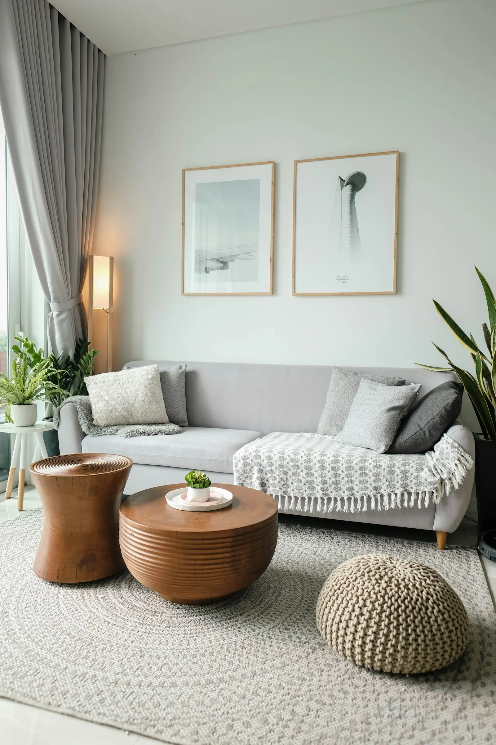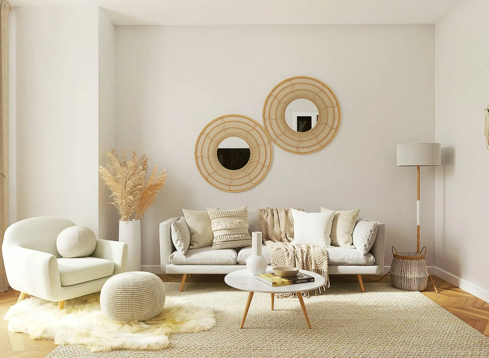
Most of the rooms we are asked to fix are not ugly. They are simply cold: pale grey walls, white ceilings, a grey sofa and a grey rug. Everything matches; nothing glows.
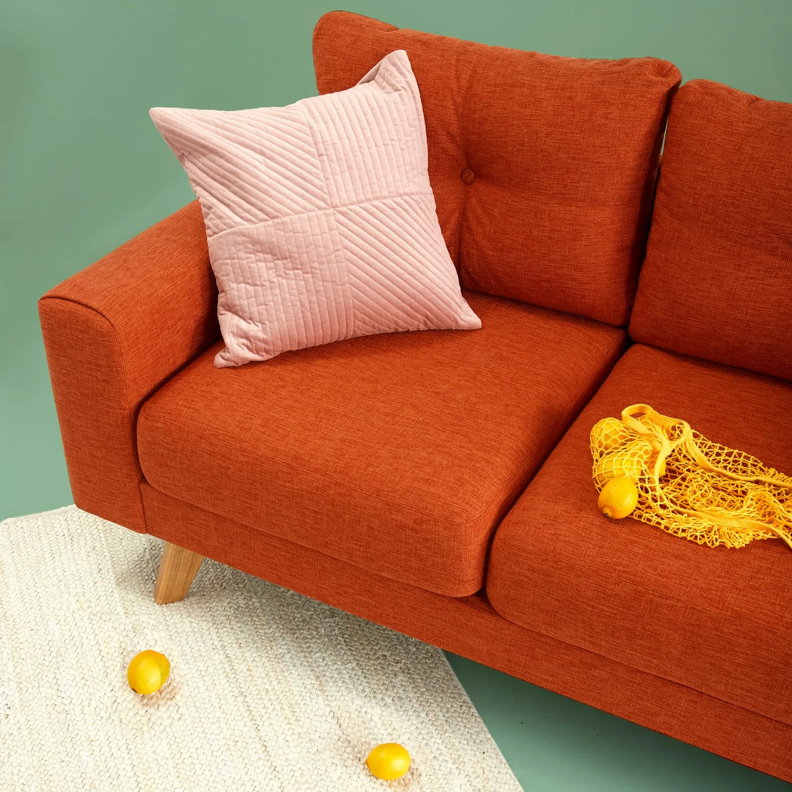
Terracotta solves this better than almost any colour we know. It sits between red, orange and brown, so it warms a scheme without shouting. It is the colour of fired clay, so it reads as a material rather than a paint chip.
Start small
You do not need a terracotta wall. Start with one object at eye level — a lamp base, a planter, a cushion — and see how the room changes in evening light. Then add a second, smaller echo across the room.
“One warm colour, repeated three times, is a scheme. Repeated ten times, it’s a theme park.”
What it pairs with
- Sand, oat and bone whites for a soft, Mediterranean feel
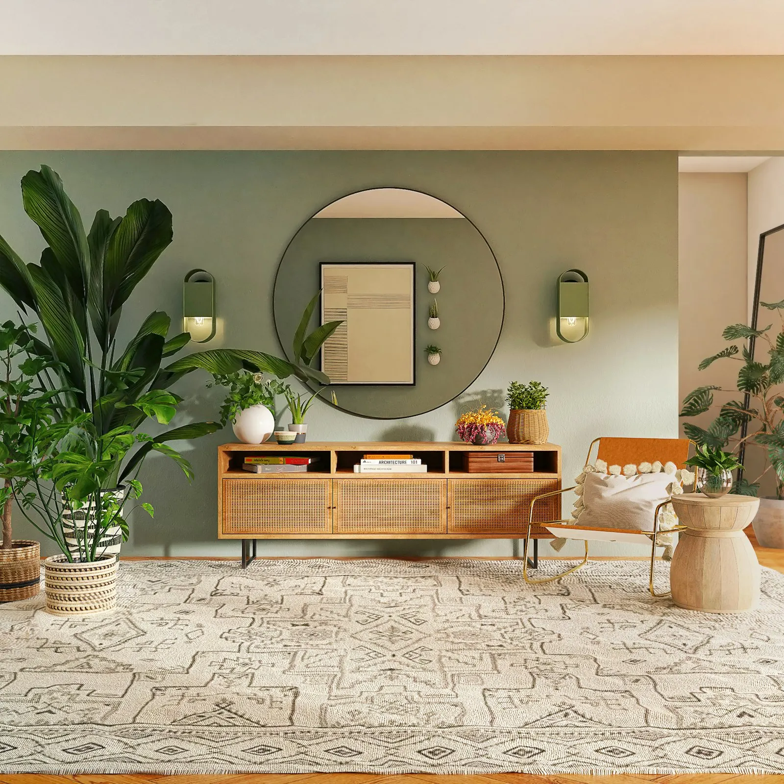
- Deep olive or sage for an earthy, grown-up room
- Ink blue for contrast in a study or dining room
Avoid pairing it with cool, bright whites; they make terracotta look muddy. A white with a drop of yellow, like our studio favourite “Bone China”, lets it breathe.